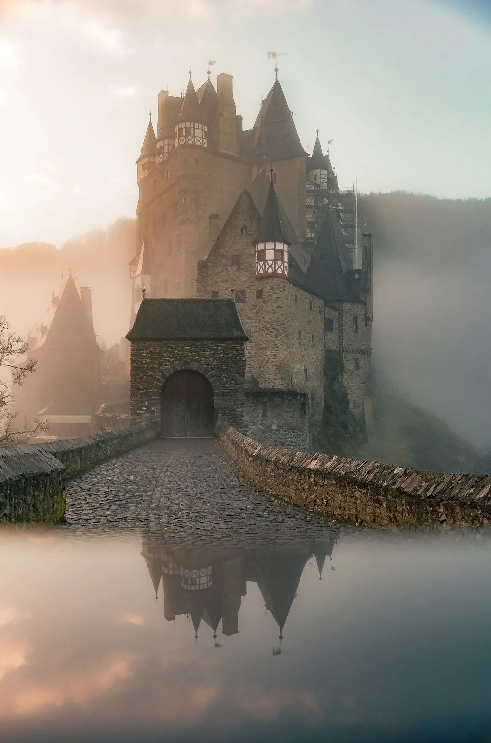
Color Theory as an Emotional Instrument
Color is the fastest route to the human subconscious. Long before a viewer registers what clothing a subject is wearing or what architectural style frames the background, their brain has already responded emotionally to the overall color palette. Warm ambers and honey golds trigger feelings of comfort and safety; cold cyans and deep indigos evoke solitude or futuristic intrigue; muted pastel tones create nostalgia, gentleness, and peace.
In generative AI, unguided color schemes default to chaotic, oversaturated commercial spectrums. By mastering intentional color grading terminology, you can anchor your prompts in sophisticated, harmonious palettes that look professionally graded by a master colorist. In this guide, Prompt360 Labs explores monochromatic, complementary, and pastel color engineering.
1. Monochromatic Palettes: The Power of Tonal Restraint
A monochromatic palette utilizes a single base hue, varying only its saturation, luminosity, and value. Restricting your color palette creates immense visual discipline and elegance, drawing immediate focus to textures and subject emotion.
Warm Amber / Ochre Monochromatic
Common in vintage nostalgia, cozy cabin portraits, and autumn sessions. Every element—from the subject’s knit sweater to the wooden walls and amber lighting—stays within warm earth-toned spectrums.
monochromatic warm amber fine-art portrait of a 30yo man in a cozy dimly lit timber cabin, chunky ochre wool sweater, warm candlelight casting golden highlights across weathered skin, deep chocolate brown shadows, 50mm f/1.4 lens, harmonious earth-tone grading --ar 4:5 --stylize 220
Cool Slate / Indigo Monochromatic
Used for introspective, dramatic, or nocturnal themes. Think blue-hour twilight, stormy coastal cliffs, or moody modern architecture.
2. Split-Complementary and Dual-Tone Harmonies
Complementary colors sit directly opposite one another on the traditional color wheel. In Hollywood cinema, the most legendary complementary pair is teal and orange (cyan ambient shadows paired with warm golden skin highlights). Because human skin inherently contains warm red and yellow undertones, cooling the background shadows creates maximum chromatic pop.
How to Prompt Dual Split-Color Gels
In studio portraiture, fitting strobes with opposing color gels creates high-energy, contemporary fashion editorial looks:
"Cobalt blue key strobe on left side, fiery coral fill strobe on right side""Electric magenta edge lighting contrasted against emerald green ambient fill""Warm tungsten key light offset by cool cyan shadow fill"
3. Soft Pastel Palettes (Scandinavian & Editorial Chic)
Pastel palettes feature desaturated colors with high luminance (milky whites, sage greens, dusty blush pinks, and cream). This palette is the darling of Pinterest lifestyle creators, organic skincare brands, and modern wedding photography.
chic minimalist lifestyle portrait of a 26yo woman inside a sunlit Scandinavian loft, muted pastel sage green and cream ceramic decor, wearing an oversized beige cashmere sweater, soft diffuse Nordic daylight, desaturated airy color grading, 50mm f/1.8 lens --ar 4:5
Practical Rules for Prompting Color
- Limit to 2–3 Key Colors: Avoid naming five different vibrant colors in one prompt. Chaos ruins elegance.
- Declare Shadow Color: Don’t just specify the main color; specify the shadow undertone (e.g., “cool cyan shadows with warm peach skin tones”).
- Specify Color Saturation: Use modifiers like “muted pastel”, “rich desaturated tones”, or “vivid jewel tones” to control color intensity.
Theoretical Framework & Underlying Principles
In the evolving discipline of programmatic AI photography, achieving consistent, high-yield results requires a firm grasp of both machine learning token mechanics and classical photographic optics. When a diffusion model processes a complex prompt, it relies on cross-attention mechanisms to map descriptive tokens to visual latent spaces. If your prompt lacks structural cohesion or uses ambiguous adjectives, the neural network defaults to generalized, average representations that look flat and artificial.
At Prompt360 Labs, our empirical testing demonstrates that grounding your prompts in authentic camera equipment specifications, physical light behavior, and tactile material properties creates strong semantic anchors. These anchors guide the model to allocate higher mathematical attention to spatial depth, fine micro-textures, and accurate color science.
In-Depth Case Study & Practical Workflow
To demonstrate the effectiveness of this methodology, let us examine a practical real-world scenario. Consider an art director tasked with generating editorial imagery for a high-end luxury campaign. An unrefined prompt like “pretty portrait in studio” yields a generic stock image with waxy skin and flat lighting. However, when we restructure the prompt using our multi-layered framework, the output transforms dramatically:
fine-art editorial study exploring color grading in prompts: understanding monochromatic and pastel palettes, directional studio lighting with controlled shadow falloff, authentic material textures, tactile micro-surface details, neutral color science, 85mm prime lens at f/1.8, high resolving power, gallery exhibition aesthetic --ar 4:5 --stylize 220
Step-by-Step Implementation Protocol
- Define the Primary Light Geometry: Establish the exact angle, size, and diffusion of your light source before describing styling or wardrobe.
- Incorporate Material Micro-Textures: Command specific tactile physical materials—such as raw bouclé, honed travertine, unbleached linen, or brushed titanium—to give the scene physical weight.
- Lock Down Optical Parameters: Declare a specific focal length (e.g. 50mm, 85mm, or 105mm) and an aperture value to control background compression and depth of field.
- Audit for Commercial & Copyright Safety: Ensure no trademarked brand names, designer logos, or celebrity likenesses appear in the prompt syntax.
Common Failure Modes and Troubleshooting Solutions
Even seasoned prompt engineers encounter unexpected model behaviors. Below are the three most frequent failure modes encountered in this domain and how to fix them:
- Over-Saturated Plasticity: If colors appear garish and surfaces feel synthetic, strip away subjective praise words (“ultra-detailed”, “hyper-realistic”) and introduce neutral film or sensor designations (“Hasselblad RAW color science”, “subtle organic film grain”).
- Unnatural Background Clutter: If the model populates the frame with random, distracting elements, tighten your aspect ratio and specify clean negative space: “minimalist seamless cyclorama background with gentle shadow vignette”.
- Inconsistent Lighting Direction: If shadows appear in conflicting directions, explicitly declare a single dominant key light source: “single large octabox key light positioned 45 degrees camera-left”.
Summary Checklist for Production Quality
By treating generative AI as a virtual physical camera rather than an unpredictable toy, creators unlock unprecedented visual fidelity. Whether generating commercial lookbooks, digital art exhibitions, or educational media, adhering to disciplined photographic principles ensures your work stands out with timeless artistic merit.